Project overview:
Redesign of Laudi Vidni’s bag configurator, including an interactive 3D product view with intuitive controls and enhanced customization options for a fully personalized shopping experience.
Redesign of Laudi Vidni’s bag configurator, including an interactive 3D product view with intuitive controls and enhanced customization options for a fully personalized shopping experience.
ORIGINAL CONFIGURATOR:
ORIGINAL CONFIGURATOR:

Analysis of the current state:
Analysis of the current state:

Readability is an issue
Readability is an issue

Shopping call-to-action buttons should be in a more intuitive place and not interfere with the 3D model
Shopping call-to-action buttons should be in a more intuitive place and not interfere with the 3D model

Too much unused space
Too much unused space

Font styles and elements like buttons, state indicators, etc., were not consistent and aligned with the brand
Font styles and elements like buttons, state indicators, etc., were not consistent and aligned with the brand
Design process and the solution
Design process and the solution
I noticed there was no intuitive way to leave the page, which could frustrate users or feel intentionally restrictive, potentially harming our brand. To improve usability and give users more control, I added a 'Back' button.
I noticed there was no intuitive way to leave the page, which could frustrate users or feel intentionally restrictive, potentially harming our brand. To improve usability and give users more control, I added a 'Back' button.


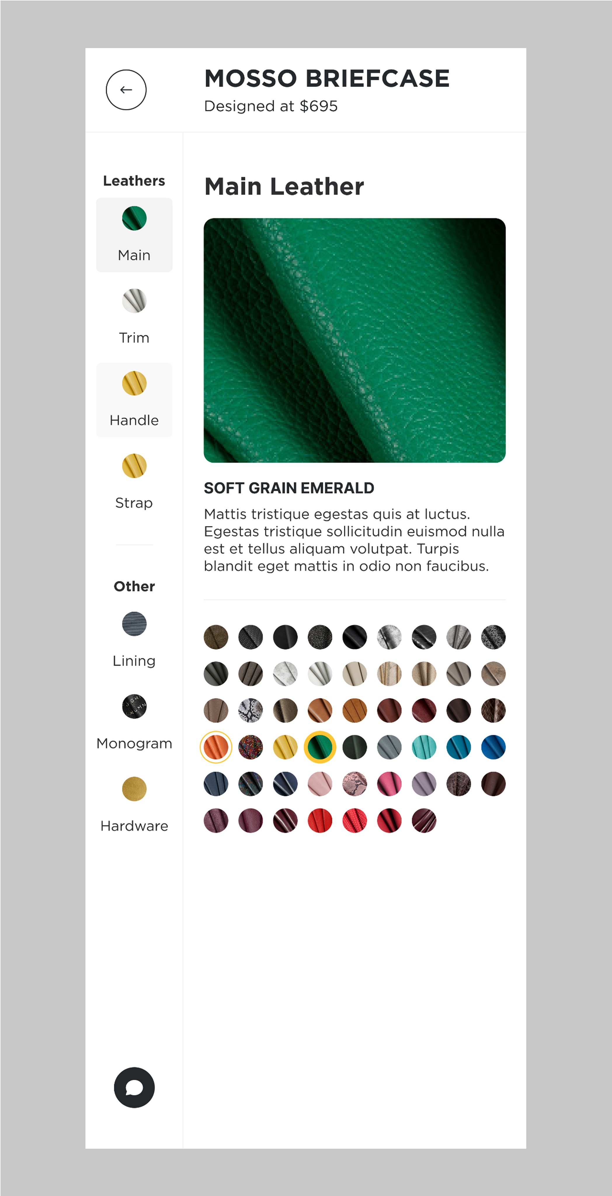
By moving the view controls to the side and adding icons, I created a cleaner integration that gives the 3D model more space to stand out and stay in focus.
By moving the view controls to the side and adding icons, I created a cleaner integration that gives the 3D model more space to stand out and stay in focus.
Each page loads with the 3D model zoomed in and positioned to highlight the specific part of the bag being customized. Resetting the view upon navigation ensures users consistently begin each step from the optimal perspective, enhancing focus and streamlining the customization process.
Each page loads with the 3D model zoomed in and positioned to highlight the specific part of the bag being customized. Resetting the view upon navigation ensures users consistently begin each step from the optimal perspective, enhancing focus and streamlining the customization process.

Sidebar Experience
Sidebar Experience

What stood out first was that there was one extra step in the selection process. Every extra click can wear users down and make them lose focus, which can quickly lead to frustration. In this case, having to go back after choosing an option felt unnecessary.
What stood out first was that there was one extra step in the selection process. Every extra click can wear users down and make them lose focus, which can quickly lead to frustration. In this case, having to go back after choosing an option felt unnecessary.

The first solution was to remove the extra step and simplify the tabs by using ‘Leather’ as the main category label, with the specific leather name shown above the selection. I avoided adding the leather name on the tabs to keep the design clean since the details appear in the pop-up panel beside the sidebar. To improve the look and feel, the sidebar options were placed in a circular container, softening sharp corners and allowing more options without scrolling.
The first solution was to remove the extra step and simplify the tabs by using ‘Leather’ as the main category label, with the specific leather name shown above the selection. I avoided adding the leather name on the tabs to keep the design clean since the details appear in the pop-up panel beside the sidebar. To improve the look and feel, the sidebar options were placed in a circular container, softening sharp corners and allowing more options without scrolling.
First Version Problems
First Version Problems
The issue with this version was that users had to select an option before knowing what they were choosing, since the description only appeared after selecting the leather type (main, trim, handle, or strap)
The issue with this version was that users had to select an option before knowing what they were choosing, since the description only appeared after selecting the leather type (main, trim, handle, or strap)

While offering many choices has its benefits, it can also cause visual clutter. I wondered if reducing the number of sidebar options might create a better user experience.
While offering many choices has its benefits, it can also cause visual clutter. I wondered if reducing the number of sidebar options might create a better user experience.

Considered using bigger circles. However, making them too large caused clashes with the popup panel, as both elements compete for attention.
Considered using bigger circles. However, making them too large caused clashes with the popup panel, as both elements compete for attention.
What if everything were integrated into one space, allowing the user to focus on all product design options in a single, dedicated area?

SIdebar solution
The result
The result


Email:
marko.dostana@gmail.com
marko.dostana@gmail.com
marko.dostana@gmail.com
marko.dostana@gmail.com